Coming to America
Designed and Developed by: Yujia Huo & Kathleen Foley
https://globalcit.eu/modes-acquisition-citizenship/
View the project
The visualization focuses on immigration to the United States, presenting information about the structure of the immigrant population, categories for acquiring citizenship, and a brief overview of the process.
Design Process

Research Question
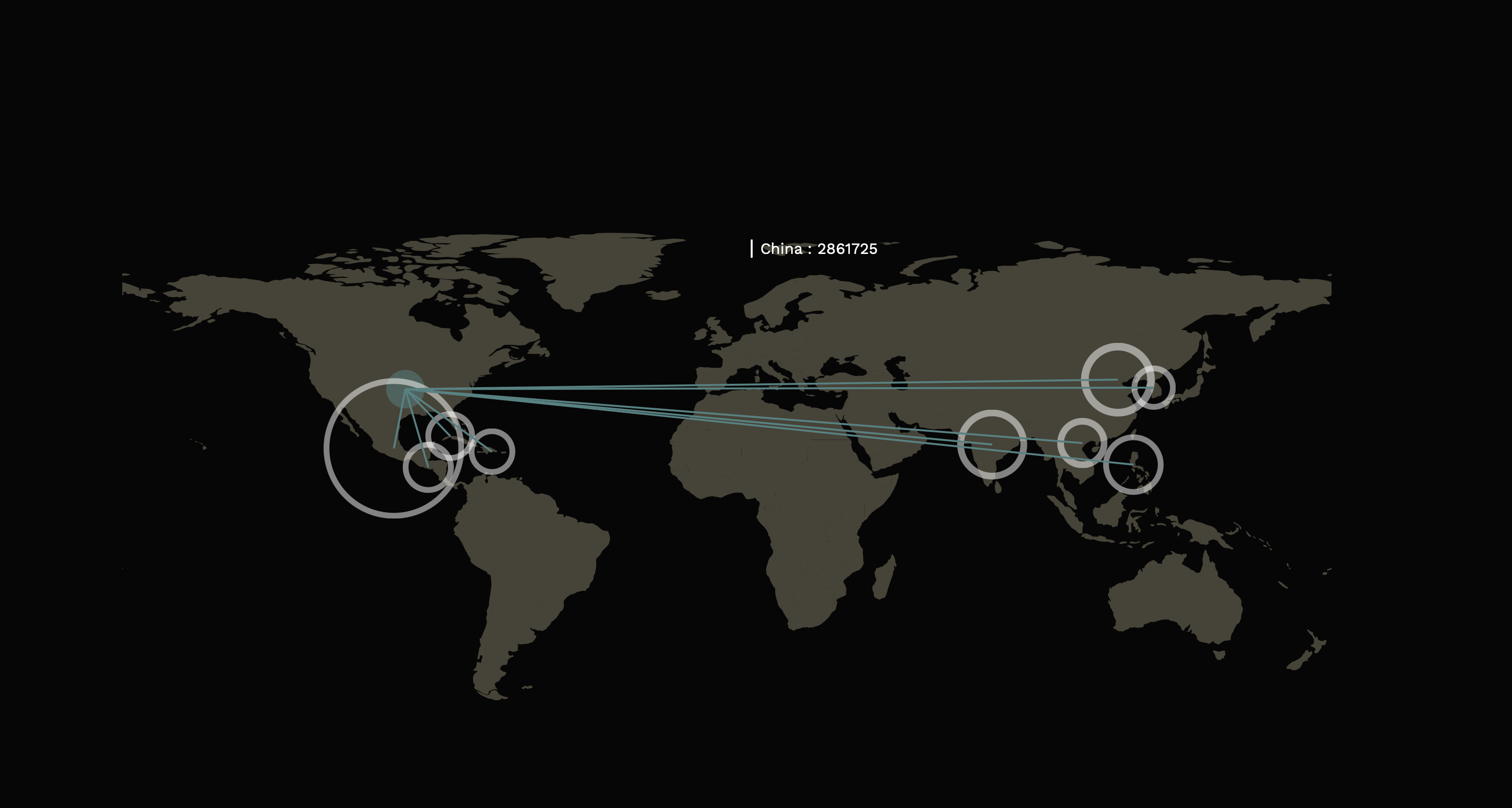
Which countries have largest population of immigrants?
how to acquiring citizenship?
Visual References
I search on Behance to find reference relate to migration. I found that using line cross the map effective shows movement and distribution.
Design Detail
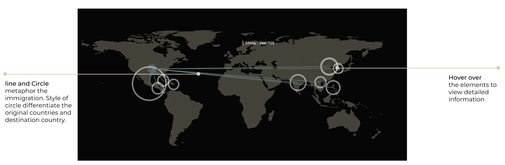
Visualization 1: Map
Which countries have largest population of immigrants?
The animated visualization using path and circle on the map to shows the countries of origin of immigrants and the size of the population. Lines color align with the destination circle(US) accompany with the animation to construct clear guide of visual direction.
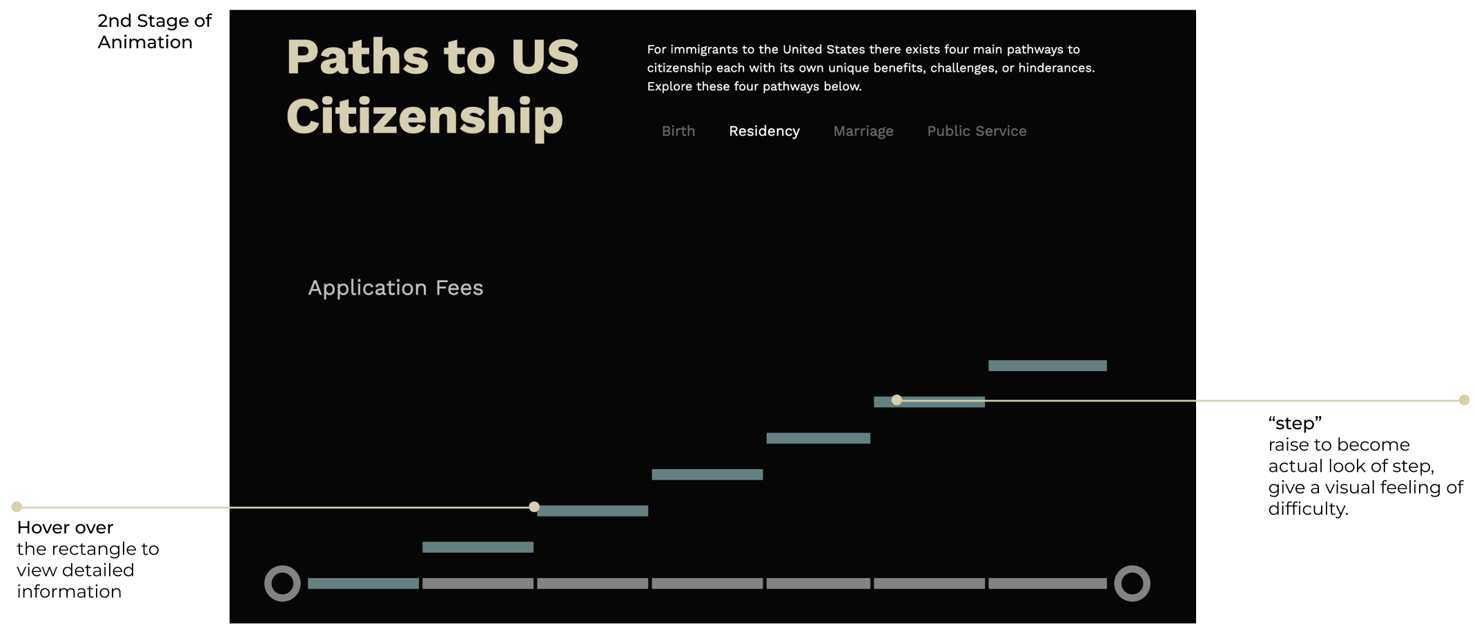
Visualization 2: "Steps"
how to acquiring citizenship?
The animated visualization metaphorically shows the 'step' that immigrants needs to take to gain citizenship. Different path has different level of step.