UFOs in the USA
Designed and Developed by: Yujia Huo
https://nuforc.org
View the project
Design Process

Research Question
Which area sees UFOs more often?
What's the trend in sighting reports?
What do people see?
What do people say?
Visual References
To gather inspiration and visual references for my project, I explore Tableau Public, seeking projects with similar data. This exploration offers valuable insights into color schemes, chart type selection, typography, and unique data perspectives.
Design Detail
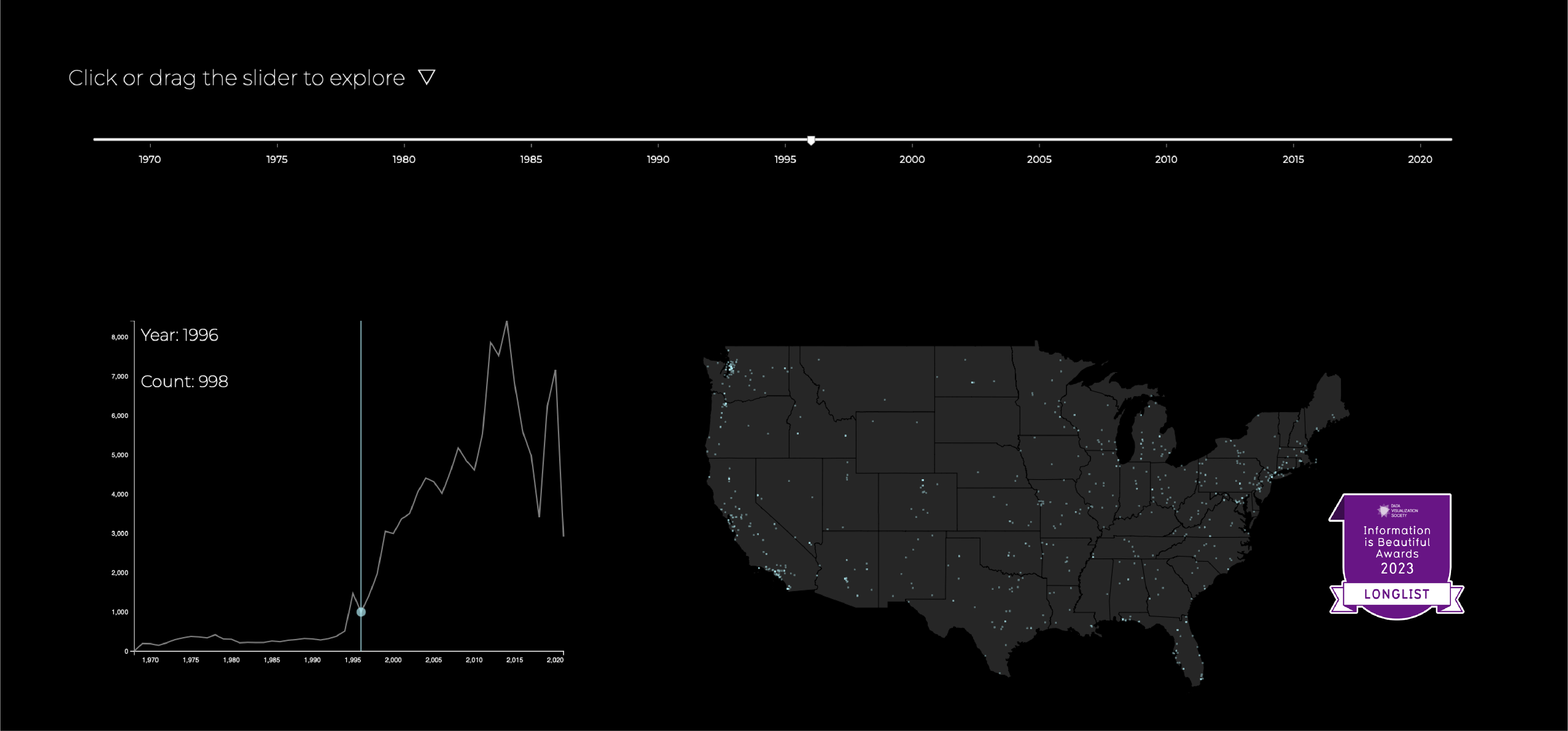
Visualization: Location and Trending
Which area sees UFOs more often?
What's the trend in sighting reports?
The first section presents the trends and locations of UFO sightings, allowing users to explore the yearly distribution and count of sightings. The visualization includes a slider as an interactive tool and a line chart and map to create a relationship for a better exploration experience.

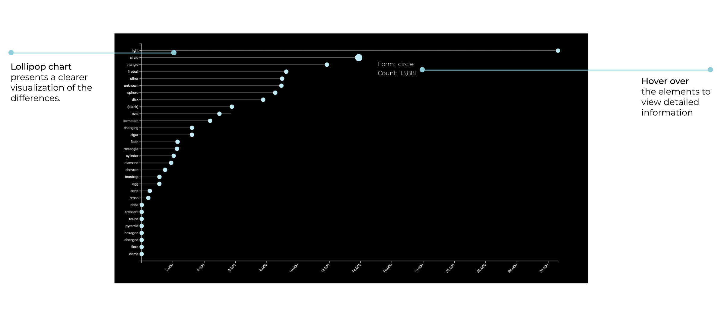
Visualization: Shapes
What do people see?
We definitely interested in to see what people saw, and find some insight from that. The lollipop chart shows the count of each shape.
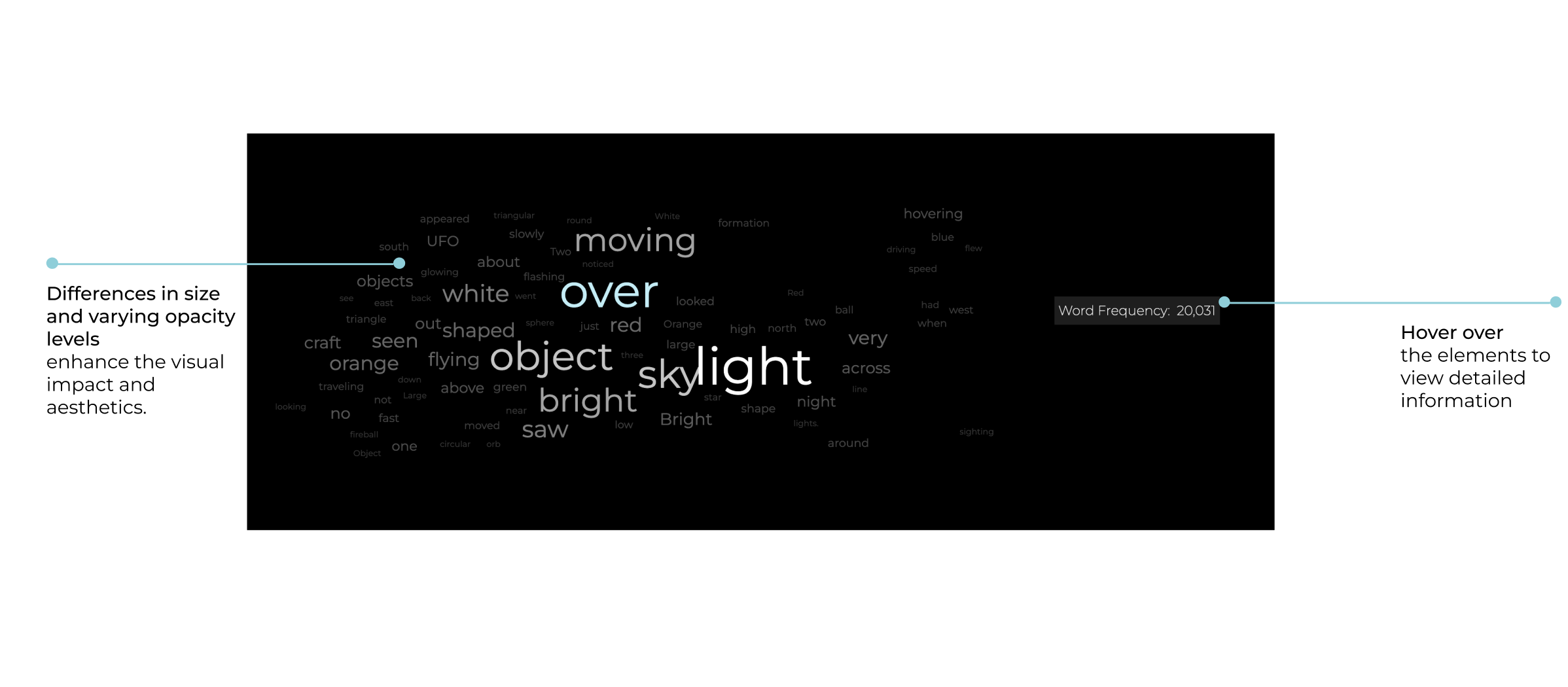
Visualization: Witness Testimonies
What do people say?
The data collected witness testimonies of the reported sightings, which provide a firsthand account of the events. These testimonies add credibility to the sightings and help in understanding the nature of the sightings. The word cloud shows the top 80 most common words that witness use in their testimonies.